


Why Product Builders Need to Look Up: Design Lessons from Harry Gruyaert
If you are designing mobile apps, digital services, or marketing campaigns, you are likely optimizing for maximum screen time. But the most successful products of the next decade will not compete for mindless scrolls. They will integrate seamlessly with physical reality.
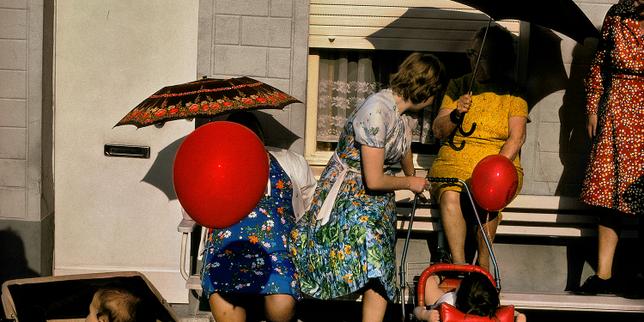
Legendary Magnum photographer Harry Gruyaert has spent sixty years capturing how humans fit into urban spaces. His exhibition, "A Sense of Place," highlights a growing tension: people are missing the rich, complex beauty of their physical environments because they cannot look away from their screens. For product builders, this is not just a cultural critique. It is a design challenge.
If your software ignores the physical context of the user, you are building in a vacuum. To build tools that people love, we need to understand how our users interact with the world around them, not just our pixels.
Why does physical context matter for product design?
Most developers build software assuming undivided user attention. We write code for clean desktop monitors or focused mobile simulator sessions. In reality, your user is walking down a crowded street, dodging traffic, or sitting in a noisy coffee shop.
Gruyaert’s photography focuses on how light, color, and human activity collide in real-time. He does not stage his shots; he observes the chaos and finds the pattern. When you design products, you must adopt this observational mindset to understand the physical environments where your app is actually used.
- Context-aware UI: Your app should adapt to ambient light, movement, and location dynamically.
- Cognitive load reduction: If a user is navigating a physical space, your interface must require minimal mental effort to navigate.
- Micro-interactions: Design for quick, high-value interactions rather than long, attention-sucking sessions.
Building with physical context in mind makes your product feel native to the user's life. It transforms your software from an annoying distraction into an essential tool.
How can we build products that respect human attention?
The metrics we track often encourage bad design decisions. We measure daily active users and time-in-app, which leads to features designed to keep eyes glued to glass. This approach creates a hostile user experience over time.
When users realize an app is draining their time without adding real value, they delete it or turn off notifications. Instead of designing for infinite scroll, we should design for utility and quick exits. The goal should be to help the user accomplish a task and get them back to their life.
- Push notifications with purpose: Only interrupt the user when the physical world requires their digital input.
- Glanceable interfaces: Use high-contrast typography and clear visual hierarchy so users get what they need in two seconds.
- Offline-first functionality: Ensure your product works when users are actually out exploring, not just when they have a perfect 5G connection.
Great engineering respects the user's environment. By building tools that solve a problem and then get out of the way, you build long-term trust and retention.
What can developers learn from visual composition?
Gruyaert is famous for his masterclass in color and framing. He does not just take pictures; he structures visual information to tell a story instantly. Software development and UI design require the exact same discipline.
Your codebase might be clean, but if your visual hierarchy is messy, the product fails. Look at your application layout the way a photographer looks through a viewfinder. Every element on the screen must have a specific reason to exist.
- Visual weight: Use color contrast to guide the user's eye to the primary action button immediately.
- Negative space: Do not crowd your interface; empty space is just as important as the data you display.
- Consistency: Establish a clear visual language so users do not have to relearn how to navigate different pages of your app.
When you master visual composition, your product becomes intuitive. Users do not have to think about how to use it; they just do.
Next time you review a product roadmap or a UI mockup, step outside. Test your prototype on a sunny sidewalk, with one hand, while walking. See how much of the interface holds up when the physical world competes for attention. If your app fails in the wild, go back to the drawing board and build for the real world, not the simulator.

Convert PDF to Word — Word, Excel, PowerPoint, Image